Designing Accessible eLearning: ADA, Section 508, and WCAG
In this article, you’ll find out what laws and standards regulate matters of accessibility and the difference between them. We’ll also provide you with tips and tools you may need to adapt your training to the special needs of your learners.
Wheelchair ramps might be the first thing that comes to mind when you think of the word “accessibility”. Since the world has been moving online, accessibility is no longer limited to physical accommodations. For many instructional designers, the need to make their training accessible for people with disabilities is a serious task to deal with in every project.
One of the reasons to care about accessibility is the legal aspect. In many countries, say, in the US and the UK, lack of online training availability can be considered discriminatory against people with disabilities. (Please note that this article is not qualified legal advice. It is based on iSpring’s subjective experience and aims to give you some context of the topic.)
Another reason why you should care about accessibility (apart from the risk of being sued) is the general user experience. In fact, making barrier-free learning includes making it easy to use and easy to understand, and therefore, you improve the learning experience for everyone. It’s an absolute win-win situation.
What Are Accessibility Standards?
In general, all the accessibility standards have the same goal: making learning available to every learner of any age, in any state of health, with different needs and abilities.
When it comes to eLearning development, it is important to be aware of the existing standards and if your project is subject to any laws. This knowledge, whether accessibility in your case is a gesture of goodwill or a crucial requirement, will affect the development process and the tools and solutions you choose, and allow you to make informed decisions.
There are two major laws and extensive guidelines that govern accessibility:
- The Americans with Disabilities Act, or ADA (In the US. In the UK, there’s the Equality Act)
- Section 508 of the Rehabilitation Act of 1973 (In Europe, there’s the European Accessibility Act)
- Web Content Accessibility Guidelines, or WCAG
ADA
The ADA is a civil rights law that guarantees that people with disabilities have the same rights and opportunities as everyone else. Its purpose is to make sure that all areas of public life such as jobs, schools, and transport are equally available to those with disabilities.
Who should be compliant: All private and public companies that are considered “public accommodations.” Public accommodation includes (but is not limited to):
- Retail stores
- Restaurants
- Hotels
- Theaters and museums
- Banks
- Healthcare centers
- Schools
Section 508
Section 508 is a federal law that requires that all electronic and information technologies used by US federal agencies can be equally effectively used by people with disabilities and without them. These technologies include computer hardware and software, websites, and apps. The law refers to both federal agencies’ employees and citizens who are seeking services or information from federal agencies.
Who should be compliant: The law applies to any federal department or agency and it also affects anyone who works with the U.S. government. These include:
- Government organizations
- Federally funded organizations
- Higher education institutions
- K-12 schools
- Government contractors
WCAG
Web Content Accessibility Guidelines (WCAG) is an extensive set of guidelines on how to develop accessible electronic content such as websites, apps, or online courses.
The guidelines were developed by The World Wide Web Consortium (W3C), the main international standards organization for the World Wide Web. As of 7 September 2019, W3C has 451 organization members; among them, there are companies such as Google, Facebook, and Microsoft.
Who should be compliant: WCAG itself doesn’t have official power to require compliance. However, these guidelines are often used as a reference for accessibility criteria in certain projects, as well as the reference for the standards from the government. For example, in 2017, Section 508 was revised and refreshed, and now it has adopted the WCAG requirements for web content.
How Do I Measure Accessibility?
According to W3C and WCAG 2.1 guidelines, there are three levels of accessibility: A, AA, and AAA.
A is the minimum level, with 30 success criteria to be met. The A level is the easiest to meet since most of the requirements involve usability. For example, you need to provide captions for prerecorded audio and video.
AA is the medium difficulty level and has 20 additional success criteria. For example, at the AA level you can’t use images of text (with a few exceptions such as logos), only text, so it’s possible for screen readers to convey information effectively.
Most organizations aim for the AA level since it makes sure the content is consumable, operable in general, and adapted for those who are visually or hearing impaired.
AAA is the highest level of accessibility and requires the maximum effort to meet. It has another 28 success criteria. AAA accessibility is usually used by organizations that specialize inaccessibility and includes rather expensive requirements such as sign language interpretation for audio.
Each level includes the criteria of the previous levels while adding new requirements on top. So, for AA compliance, you’ll need to comply with the 30 criteria of the A level plus the 20 criteria of the AA. The same goes for the AAA level: A+AA+AAA.
What Can I Do Right Now to Make eLearning More Accessible?
If you’re new to accessibility, all these requirements and conformity levels may sound scary. In fact, it’s not as bad as it seems. Below, there are some tips that are easy to apply and that can significantly improve the usability and, therefore, the accessibility of your content.
Text
1. Structure your text
What is there in common between an accessible text and an easy-to-read text that’s written in a good style? The answer is a clear structure. A consistent hierarchy of headings makes it easier for learners to quickly scan the pages and define the key ideas of the text.
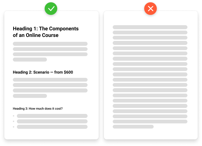
The structure of an article from the iSpring blog (left) and an article without headings. Which one would you prefer to read?
Headings are usually larger and bolder than the main body of a text. As for accessible text content, you can’t rely only on graphical identification of headings. Even if you make them big and use a different font, without the proper markup, screen readers won’t recognize them as headings and will read them as plain text.
If you create slide-based courses, make sure the headings are always formatted as such. You can also use the Accessibility checker, which is built into PowerPoint (File → Info → Check for Issues → Check Accessibility). If you create a webpage, use the H1 markup (followed by H2 and H3).
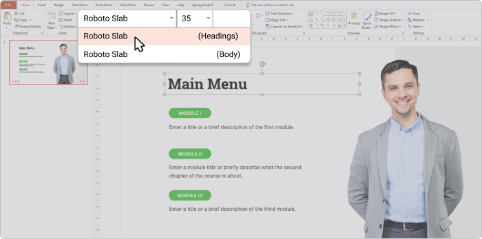
Always use a special markup for headings since making a phrase large and bold doesn’t turn it into a heading for screen readers and search engines.
Also, keep in mind that long paragraphs are difficult to read. Try to break them into smaller parts using the concept “one paragraph, one new idea.”
If there’s an enumeration of homogeneous sentence members, use bulleted or numbered lists. They will make the text look:
- easy to read,
- well structured,
- and less intimidating.
2. Be picky about fonts
Avoid too-small font sizes as well as too large, since both options can make text difficult to read. While the first one creates eyestrain, the last one makes users sit back. The generally accepted size for the main body text is 16px.
Also, to avoid any confusion, it’s better to stick to only one or two fonts and try to use the most common fonts:
- Serif fonts. A serif is a little decorative line that is found on letters in some fonts like Times New Roman or Georgia (have a look at the picture below). For some people, it’s difficult to read serif fonts because the serif distracts the eyes from the general shape of the letter.
- Sans-serif fonts. “Sans serif” means “without the decorative line.” Arial, Calibri, Century Gothic, Helvetica, Tahoma, and Verdana are the most well-known representatives of the sans-serif family.
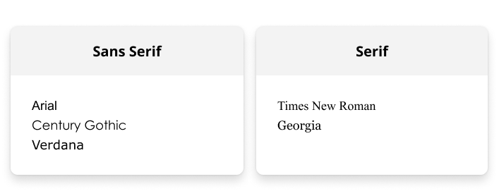
Examples of accessible fonts
3. Use descriptive links
By descriptive links, we mean meaningful links that provide users with information about where the link leads or what will happen after they click. Compare:
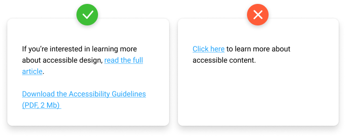
If clicking on a link downloads a file, always inform about its size and format.
Making your links descriptive is a good exercise in writing and style. “Click here” is a rather clumsy way to finish a sentence even for people with normal vision. To contact the support team, click here. For people who use screen readers and cannot quickly scan the whole page to get the context, it is especially frustrating. Instead, if you just say, “Contact the support team,” you’ll make the text more readable and concise.
Colors and Images
4. Avoid text in pictures (at all costs)
Using text as an image is a bad idea. Screen readers (as well as search engines and translating software) can’t recognize it as text and therefore read it. When such an image is zoomed, its quality gets worse, and it’s hard to read since all you can see are pixels.
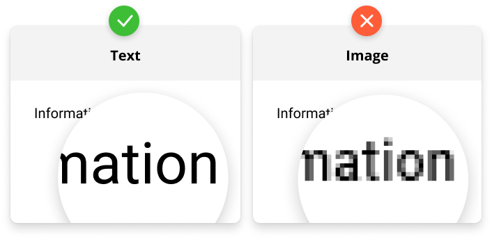
The word “Information” is pixelated after zooming in.
Plus, you’ll make your own life difficult, since editing such text or correcting even the smallest mistakes will require much more time and effort.
5. Add alt text for images
Alt text is a text alternative to an image. For example, if you have a bad Internet connection and some image doesn’t load, you’ll see a text description of the picture. Or if you use a screen reader device, it’ll read the alt text to provide context. Of course, it works only for cases when someone takes care of alt texts.
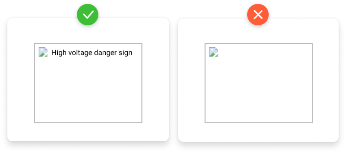
Alt text gives users enough context to understand the idea even without being able to see graphics.
The alt text works just like captions for video; it describes what a user should be seeing. For instance, if you create a quiz or an interaction with iSpring Suite, it allows you to provide alternative text for images.
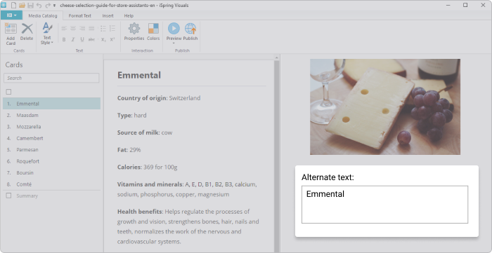
Alt text feature in iSpring Suite
6. Don’t rely on colors alone
We often use a bright red color to draw attention to some elements or highlight mistakes when filling out forms. But there are about 300 million people with color blindness worldwide; for comparison, the population of the US was 327.2 million people in 2018. Therefore, colors should never be used as a single source of information.
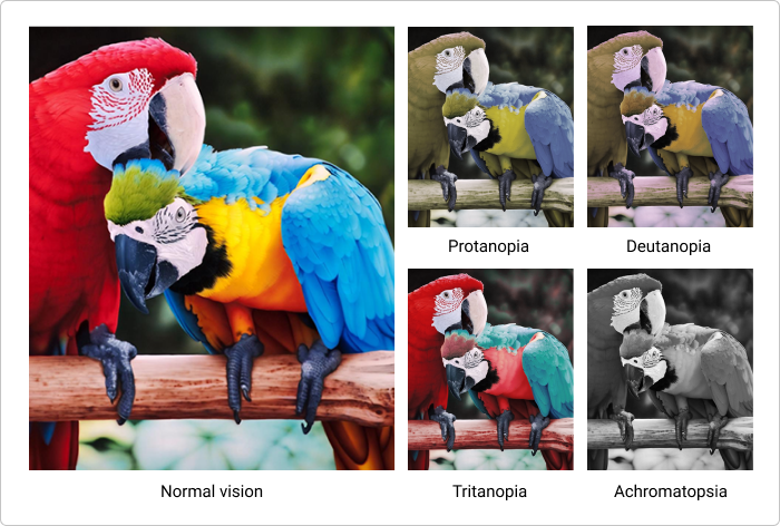
How people with different color blindnesses see the same photo.
Any meaningful element such as a button should be supplemented with a caption so it’ll work no matter what happens with colors.
7. Provide sufficient contrast
Information is easier to perceive when there is sufficient contrast between the text, graphic elements, and background. If the color of your text is too close to the color of the background, or you use a photo as the background, it makes the content difficult or impossible to understand.
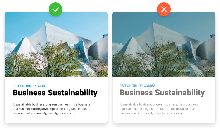
The low contrast text (right) is harder to read even for a person without any disabilities.
The WCAG AA level requirements suggest the minimum contrast ratio between text and its background to be 4.5:1 for regular text and 3:1 for large-scale text. Text is considered to be large when it’s 18 pt if not bold and 14 pt if bold. The requirements of the AAA level are stricter: 7:1 for regular and 4.5:1 for large text.
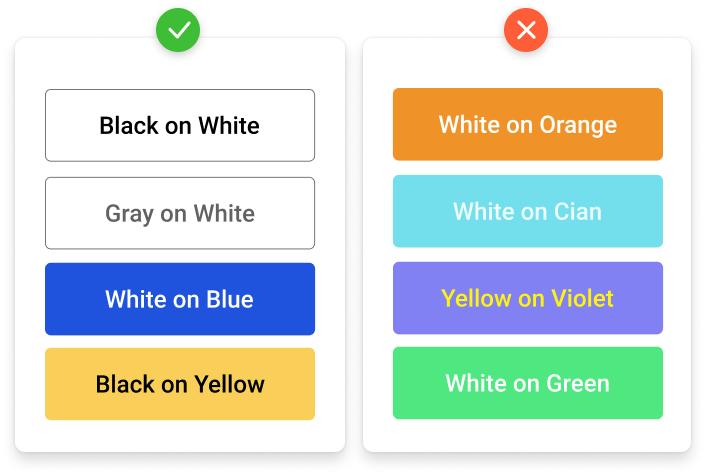
Black and white is always a great color combo.
There are plenty of online tools such as WebAim and Accessible Colors that allow you to easily check the contrast.
Also, some authoring tools allow you special accessibility modes. In iSpring Suite, you can publish accessible quizzes by ticking a single checkbox. When a learner turns on this mode, the quiz will go into a simplified view which most screen readers can easily recognize.

Standard mode vs accessibility mode.
Multimedia
8. Prepare captions and transcripts
Creating alternative ways to consume information provides equal access to content for learners with disabilities. Captions for video and transcripts of audio make content accessible for users with hearing or visual disabilities and provide a better experience for learners with different learning styles.
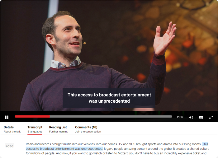
Ted Talks videos have both captions and transcripts.
To lower the amount of manual work preparing transcripts, you can try using various speech-to-text converters and, as for captions, the easiest way to create them is by using YouTube.
9. Give learners the control
People with cognitive impairments often need more time to digest content, especially if they have memory problems. To help them to get the maximum out of training, make the course navigation open to allow them to review what they’ve studied.
Also, it’s better to avoid time-limited activities and auto-advancing content when possible (even though those things may look really cool). The problem with auto-advancing content, such as animations and interactive elements, is that they can prevent learners from reading the whole text or studying the whole lesson. If you believe that these elements are necessary, give learners an opportunity to take their time, take a step back to finish reading, and pause or skip the interaction.
Let us know if you’re using any of the tips described in the article, and especially if you have your own golden rules for creating accessible content. We’d love to hear about your experience!
More Articles on Accessible eLearning and Standards from the iSpring Blog:
- Jane Bozarth’s Designing for Accessibility
- Lesson 8. Touch Ups: Ensure Efficacy, Viability, & Accessibility in Your Content
