How to Create a Comparison Chart in PowerPoint (Template Inside)

Comparison charts and tables are wonderful tools for training and education as they have different applications in many industries. Learn how to create well-structured and visually appealing PowerPoint comparison charts with our step-by-step guide.
What is a Comparison Chart?
A comparison chart is a graphic that displays similarities and differences between two sets or multiple items of data. These can be products, concepts, timeframes, entities, or any other group that has a correlation.
Comparison charts and comparison tables serve as excellent aids for research, business, education, and decision-making. Their visual format enhances the ability to discern patterns and highlight discrepancies and differences among the compared items. The charts like Bar, Pie, Gannt or even Venn diagrams, are widely used in different online training programs. It’s a great way to compare, for instance, the present outcomes of a company to its projected performance.
How to Create a Comparison Chart
in PowerPoint
PowerPoint has strong functionalities to generate comparison charts in various formats effortlessly. Here is our comprehensive step-by-step guide on how to create a comparison chart for your PowerPoint presentations.
Step 1: Open PowerPoint
Naturally, the first step is to launch PowerPoint with double click on your device and create a new presentation or use an existing one.
Step 2: Insert a chart
In a fresh slide choose the Insert tab in the top menu. And then click Chart on the illustrations tab.

You will see a new window with many different chart formats to choose from. Pick a column format for your diagram chart.
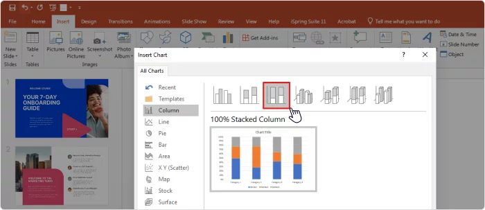
In this example, we will select the Stacked Column chart, as it provides
a clear view of the different components.
Step 3: Populate your comparison chart with data
Once you have selected your chart, it’s time to enter the data. PowerPoint makes it very easy for you by displaying a spreadsheet window where you can insert and modify all the parameters.
Alternatively, you can compare data you already have by copying the table from Excel and pasting it into PowerPoint.
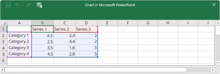
PowerPoint will initially generate four categories, each with three segments. However, you have the flexibility to add or remove categories as needed. For an organized and clean design, it’s recommended to limit your comparison charts to a maximum of six categories so you can compare your data more effectively.
Step 4: Apply the format
Now that you have entered your data, all that is left to do is make it visually appealing. Click on the chart to access the format menu on the right-hand side of the screen.
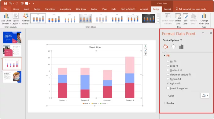
There, you can adjust the width of columns, change the colors, and even apply shadows, borders, and other design items that will enhance the visuals of your charts.
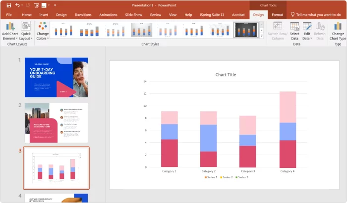
And just as easy as that, you have an informative and engaging comparison charts to use in your presentation!
How to Make a 2D Comparison Chart?
Creating a 2D comparison chart for your PowerPoint presentation is as easy as following the steps shown above. You just need to select a bidimensional design.
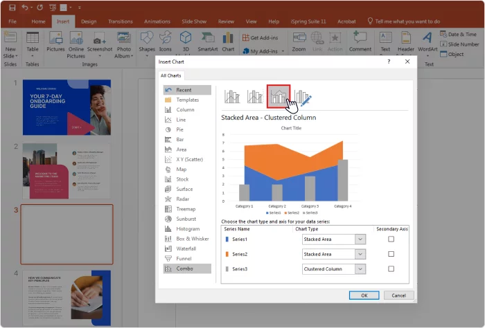
There are plenty to choose from; besides the traditional column format, PPT offers pies, bars, lines, radars, graphs, a Venn diagram, and even a combination of those elements.
Another way to compare data is to embed a PowerPoint into your presentation. This is great when you want to repurpose quality content you already have.
How to Create Comparison Tables
in PowerPoint
While charts primarily focus on presenting numerical data, comparison tables allow for more qualitative comparisons. Here is how you can make comparison tables in PowerPoint:
Step 1: Open PowerPoint and add a new slide
Once again, we need to start by launching PowerPoint on our device. Add a new slide for your table. You can add a title on top of your slide.
Step 2: Insert a Table
Go to the Insert tab on the top menu and click on Table. Then, select the number of rows and columns you need for your comparison table.

PowerPoint allows you to do this by dragging your mouse over the submenu, but you can also click on the Insert table button and enter the specific number of rows and columns for your charts.
Step 3: Enter the data
Enter the data you want to compare into the table. The top row can be used for headings, such as attributes or features you’re comparing. The subsequent rows represent the items or entities you’re comparing in your analysis.
Typically, the parameter with the highest number of items occupies the Y-axis (rows) since you can add any number of rows that you need. In contrast, the X-axis has a more restricted capacity, making it advisable to maintain it as short as possible. See the examples below.
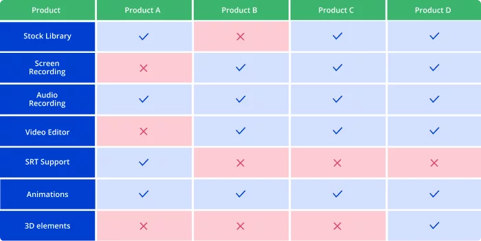
A well-distributed comparison table with the correct row-to-column proportion.
The same table with the inverted disposition. It is not as visually clear anymore. Introducing different features would lead to a congested and cluttered appearance, making it difficult to compare data.

Another useful PowerPoint tip is alternating different shades of the same color for each row. This will make your chart easier to follow.
Step 4: Apply styles
At the present time PowerPoint offers various styles that you can apply to your comparison charts. These styles can enhance the overall appearance of the chart and make it look more professional to your audience.
Consider adding icons, images, or shapes to the cells to represent specific attributes or features. This can make your comparison chart more engaging and informative.
How to Create a Comparison Slide
in PowerPoint
Here at iSpring, we are all about providing our readers with premium resources to boost their training and e-learning efforts. To simplify things, we’ve included a ready-to-use comparison chart template. Just open it in PowerPoint and customize it to your preferences with ease.
Download PowerPoint Comparison Chart Template for free →
For the best experience with PowerPoint, try iSpring Suite, a PowerPoint-based authoring tool. With the help of iSpring Suite, you can populate your presentations with engaging, quizzes, interactions, characters, and role-play scenarios, as well as transform your slides into full-fledged online courses. Get a 14-day trial for free. iSpring tech support services are available 24/7!
Another way to design a comparison chart in PowerPoint is to incorporate an assortment of graphics and diagrams into a PowerPoint comparison slide.
This leaves more space for creativity as it is not restricted by the rigid form of a chart, but it is more time-consuming as you need to add all the elements from scratch. Here are some ideas:
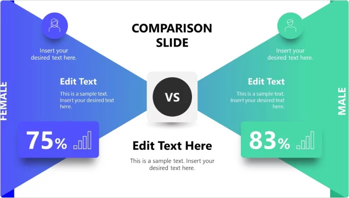

Source: https://slidemodel.com
Fortunately, there are many PowerPoint comparison chart templates that you can find online. Most of these are plug-and-play, so you just need to open the chart template file and fill it with your data. You can get stunning results for your PowerPoint presentations.
Final Thoughts
As we’ve seen, PowerPoint has robust functionalities to create comparison charts, tables, and slides with just a couple of clicks. Now is your turn to make your own comparison charts following the steps you just learned. Or you can always use our free template to save some time and have visually stunning charts for your next presentations! Please leave your thoughts in the comment section below.


