How to Structure a PowerPoint Presentation

Think of a movie that has breathtaking special effects but no storyline. Does it have any chances of becoming a blockbuster? Of course not. The same is true with a PowerPoint presentation. No matter how beautiful the visuals of your slide deck are, it will never be a success if it doesn’t follow a logically sound structure.
In this post, we’ll cover the typical presentation structure in PowerPoint – what sections it should include – and provide some practical tips on how to arrange the slides and implement these ideas technically. Use these practical guidelines to organize your slides in a clear and simple way and save time on their development. But first, let’s see why your PPT deck needs to be guided by a structure.
Why Is Structuring a PowerPoint Presentation Important?
A sound deck structure is crucial for audience understanding. When the information is presented logically, it’s much easier for a viewer to get the message. The research supports this idea – it shows that people are 40% more likely to retain structured information than unstructured information.
If you’re going to accompany your slideshow with an oral presentation, a good structure is also important for you as a speaker. It will help you feel confident, stay on topic, and avoid any awkward silences, so you’re more likely to win your audience over.
What Is the Typical PowerPoint Presentation Structure?
A good PowerPoint presentation always has a story to tell and, like any narration, it consists of three basic parts: introduction, body, and conclusion. Let’s look at each part in greater detail with some examples.
Introduction
The introduction sets the tone for the entire presentation and explains what the audience will come away with after viewing it. Here are the multiple slides you may need to add in the intro:
- The title. Introduce the topic of your presentation and provide a brief description.

- A table of contents / main menu. You can make it interactive by using hyperlinks. Viewers can choose a chapter to navigate there.
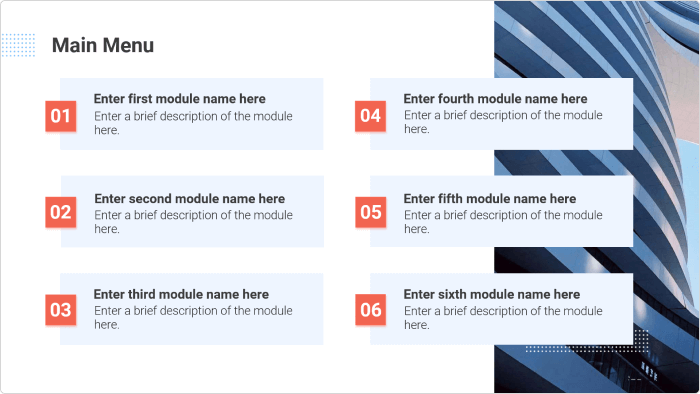
- Objectives. State your presentation’s objectives to let your audience know what new knowledge they will acquire.

- Definitions (optional). You will need this slide if you want to introduce some new terms and concepts and provide their definitions.
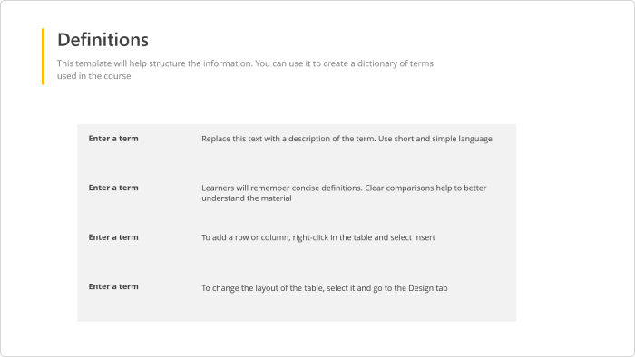 All the slide examples above are taken from the iSpring Suite Content Library. To get into more details, continue reading (?).
The body
This is the main part of your presentation, which should keep the promises you made in the introduction. This is where you explain your topic and present all your information.
Depending on the nature of your presentation, divide it into segments/points. Arrange your points in a logical order and then provide information to support each of them. There are many different ways to organize your key points, for example:
- Number your points according to their priority (1, 2, 3, …)
- Place the points in a time frame (past, present, future)
- Use narration (tell a story from beginning to end)
- Present the points with a problem-solution dynamic (state a problem, describe its impact, offer ways to solve the issue)
Conclusion
A good conclusion summarizes the key points you made or highlights what the audience should have learned. It clarifies the general purpose of your presentation and reinforces the reason for viewing it. Here are the slides you may want to include:
- Summary. List what goals your audience have achieved, what knowledge they got, and how this information can help them in the future.
- Conclusion. Here you can thank your audience for viewing the presentation.
Tips for Structuring a Presentation in PowerPoint
Now that you know which parts a typical presentation should consist of, let’s see how to structure it in PowerPoint.
1. Combine slides into sections
When working with a large PowerPoint presentation (PPT), you can create sections that can be collapsed and expanded. This will help you keep presentation slides organized and facilitate navigation in editing mode. To do that, follow these steps:
- In the list of slides, right-click on the one where you want the new section to begin, and select Add Section from the drop-down menu.
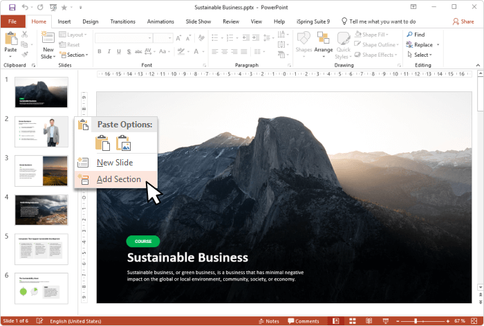
- Now right-click where it says Untitled Section, and select Rename Section. Then type in the name of the section. If necessary, repeat the process to create and name other sections.
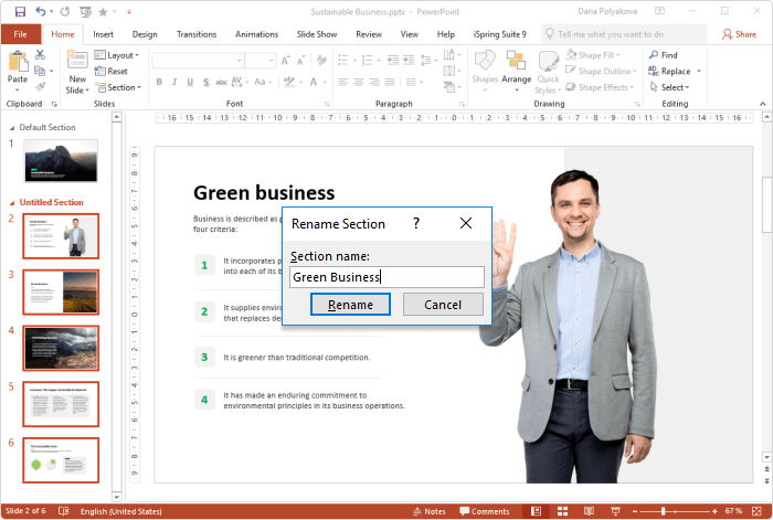
- To shift a section, right-click on its name and use the Move Section Up and Move Section Down options.
- To collapse or expand a certain section, click on the collapse icon to the left of the section name. You can also minimize and maximize all sections at once by right-clicking on the section name and choosing Collapse All or Expand All.
As well, you can access these settings by choosing Slide Sorter under the VIEW tab.
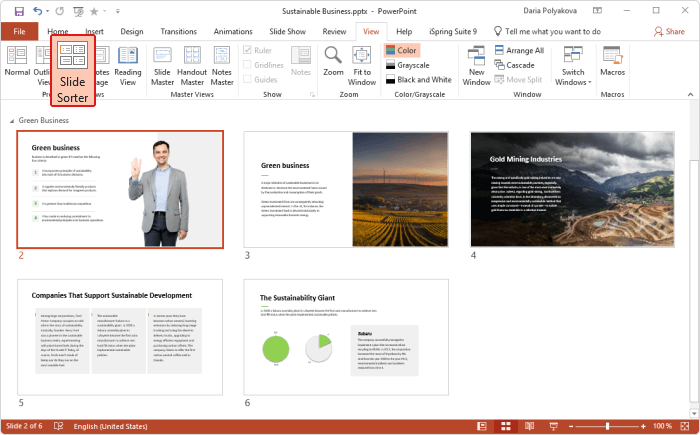
This kind of segmentation is a great way to overview the logical flow of your slides all at once and see if there are any changes required. For example, you may decide to break one slide into two or three, or the other way around.
2. Use the Outline View
One other way to structure a PowerPoint presentation in the editing mode is to use Outline View. You can choose it from the VIEW tab.
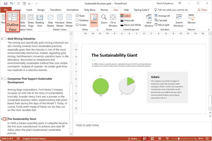
This view doesn’t display sections, but it shows the title and main text of each slide, which can give you a quick overview of the presentation contents. Here you can go through the entire text and edit it instantly. You can also work with text (on the left) and slides (on the right) simultaneously, as the latter is shown on the right side of your screen.
Note that, to be displayed in an outline, text needs to be typed in a text placeholder, not a text box. A text placeholder is a box with the words “Click to add text” or “Click to add title”, and it appears when you choose a standard layout.
You can also use Outline View to promote bullet text to titles and the other way around. To do that, right-click on a relevant title or text and select the Promote or Demote options.
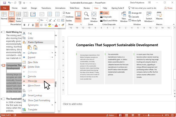
Be attentive about demoting a title, as this will delete the original slide and move its title and text to the adjacent slide.
PowerPoint only allows users to promote and demote text, not entire slides. Therefore, there’s no possibility to change the hierarchical order of slides.
3. Create a table of contents
All the aforementioned tips help you organize a presentation when formatting it. However, it’s crucial that your viewers can easily navigate through entire presentation too. One sure way to provide them with this opportunity is to create an interactive and structured table of contents.
Though there’s no native automatic outline in PowerPoint, it can be created manually:
- Insert a table of contents into the title slide or a blank one. To add a slide, click on New Slide on the ribbon. Then select all the objects on the slide and delete them.

- For the chapters, you will need to use the titles of the slides. This is where the now familiar Outline View comes in handy. You can access it from the VIEW tab. Right-click anywhere on the outline pane, choose Collapse, then Collapse All. This way, only the titles are displayed.
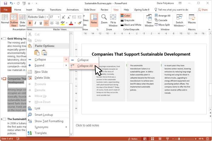
- Press Ctrl+A to select all the names, and Ctrl+C to copy them.
- Then Press Ctrl+V to paste the copied titles on the desired slide. In case there are too many titles and they don’t fit onto a single page, you can divide the table of contents into two columns or place it on two slides.
- Now select and right-click the title of the first slide and choose Link.
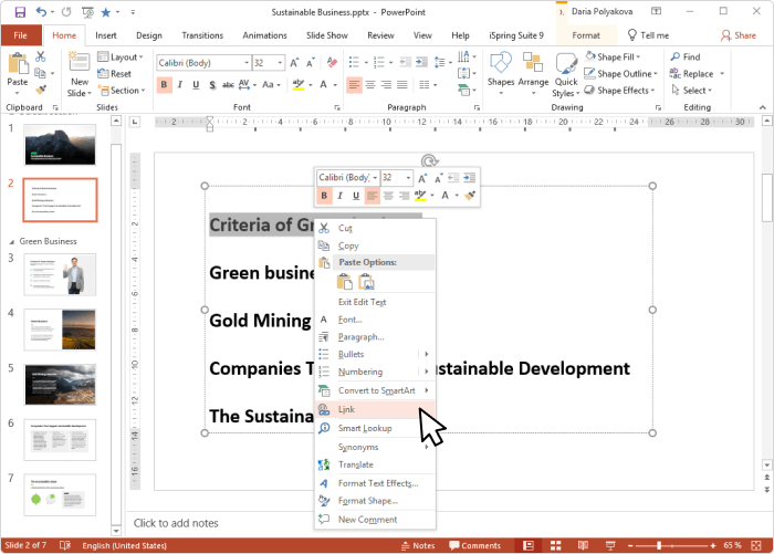
- In the open window, click on Place in This Document on the left-hand menu, then choose the corresponding slide and click OK.

You’ll need to repeat this procedure to link all the chapters to corresponding slides. For more information, read this step-by-step guide on how to add a hyperlink in PowerPoint.
Now all the chapters can be accessed from a single table of contents, which is very convenient. However, you will also need to link them back to that unifying page. You can do this by inserting an Action Button on every slide of your presentation in Slide Master mode:
- Go to the VIEW tab and choose Slide Master.

- Choose the first slide on the left, then open the Insert tab on the ribbon, click on Shapes and, under Action Buttons, select the Home button.
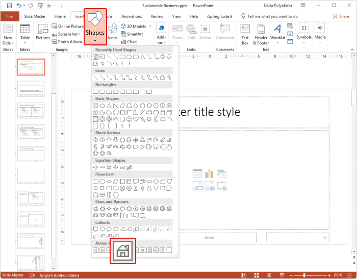
- Place the Home button anywhere on your slide – that’s where it will appear on all of them. Once you’ve placed it, the Action Settings window will appear. Under Hyperlink to: choose Slide… and then select the one with the table of contents.
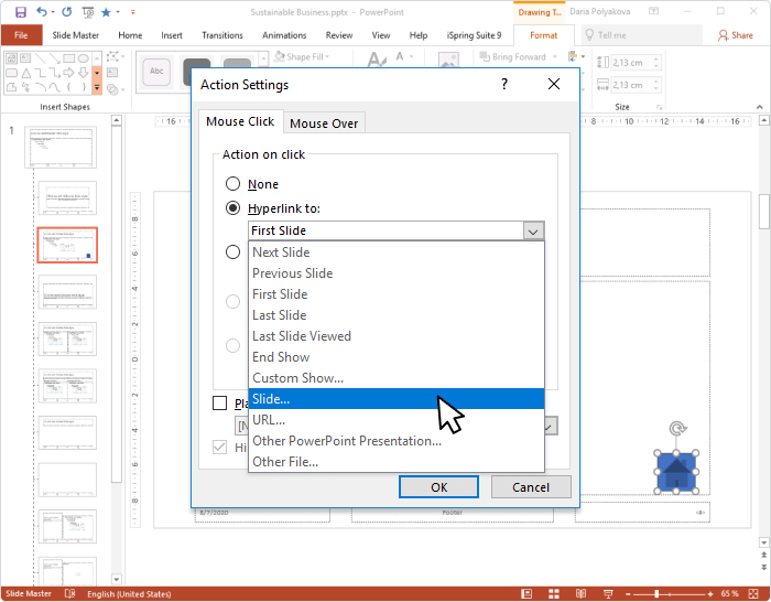
Now there is a single page from which all the other pages can be easily accessed. As well, it’s possible to go back to the table of contents at any time with the intuitive Home button.
Depending on the size of your presentation, the time it takes to create an interactive outline may vary, as you will need to add hyperlinks to every chapter manually. Be aware that if you rename a slide or simply delete it, these changes will not be automatically registered in the table of contents. For example, if you delete a slide, its title will still be displayed in the table of contents, but clicking on it won’t lead the viewer to another point in the presentation.
This is what our sample presentation looks like:
A Better Way to Structure a PowerPoint Presentation
Creating a table of contents manually might be fine for a small presentation, but if you have 122 slides, it would require too much time and energy to do so. That’s why, instead of manually creating a table of contents, we took advantage of iSpring Suite and simply enabled the automatic outline.
iSpring Suite
Fully-stocked eLearning authoring toolkit for PowerPoint. No training required to start!
Note: iSpring Suite turns slides into HTML5 format, so your audience can view them online, right in their browsers.
As you can see, the new presentation has a pop-up outline and a navigation panel, which make it possible to move to any slide at any time without leaving the slide show mode.
How to set up navigation
To create navigation in your presentation, follow these simple steps:
- Get a free trial of iSpring Suite.
- Open PowerPoint and switch to the iSpring Suite tab. Click on Slide Properties on the toolbar.

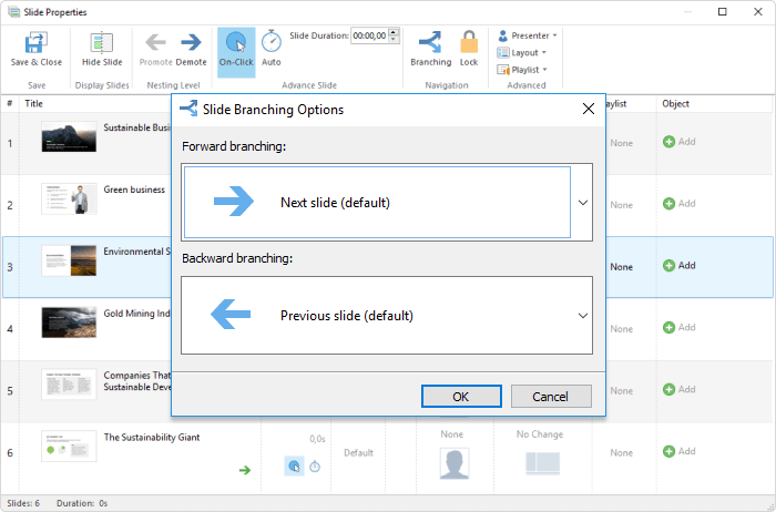
- Here you can see the slide titles. Unlike in PowerPoint, you can give a slide any name regardless of the text in the placeholder. You can also organize slides into a hierarchy by changing their nesting levels. To do that, select any slide(s) and click on the Promote or Demote buttons on the toolbar.
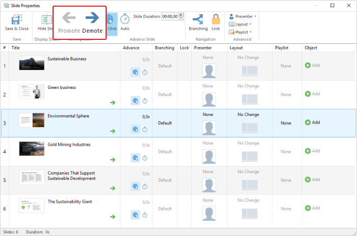 To collapse or expand nested slides, use the “-” and “+” icons to the left of a top-level slide. The arranged slides can also be easily minimized and maximized during presentation playback, since they appear as menus and sub-menus in the outline.
 - PowerPoint doesn’t have a specific panel where you can simply set up the navigation of all the slides – you need to configure it manually for each slide, which is awkward and time consuming. With iSpring Suite, you can easily turn a linear presentation into an engaging non-linear scenario. To do that, select a slide and click on the Branching button on the ribbon. Now choose the corresponding slides for users’ forward and backward actions, or None to lock navigation.
- When you’ve configured the Slide Properties settings, click on Save & Close in the upper-left corner.
How to configure an outline
Whereas PowerPoint requires the outline to be designed manually, iSpring Suite has already prepared it for you. At the same time, you don’t have to stick with the standard outline template, as you can easily customize the player’s final look and feel:
- On the iSpring Suite toolbar, click on Publish.

- Find Player and click on Universal (Full).
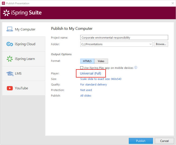
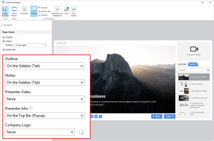
- In the opened window, you can define which elements to display and where. Here, you can also decide where to put the outline.
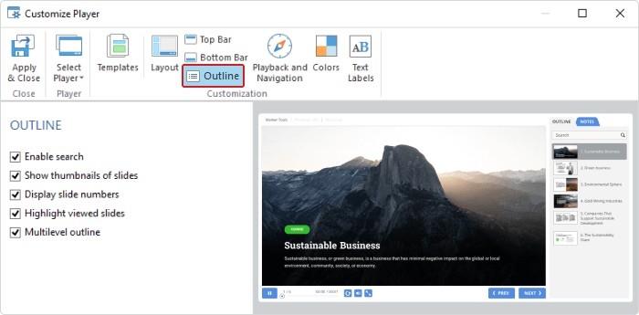
- To adjust the outline appearance, click on Outline on the ribbon and select which options to include.
We recommend leaving Enable Search marked, as this will allow viewers to search for any content at any time, including the texts on the slides. This is especially useful for large presentations with a lot of text.
If you have previously arranged slides into multiple levels in the Slide Properties, then leave Multilevel outline marked. That way, the outline will display the nesting structure of the presentation, facilitating navigation. You can learn more about the other outline options here.
- Customize the color scheme and edit text using the Colors and Text Labels options on the ribbon, respectively.
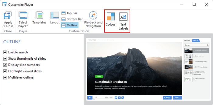
- When you have finished configuring the player, click on Apply & Close in the upper-left corner.
- Now you can publish your enhanced presentation either to HTML5, to make it easily accessible via browser on any device, or MP4 video format. If you’re going to upload your presentation to an LMS, you can publish it to any eLearning format: SCORM, AICC, Tin Can, or cmi5.
While a standard PowerPoint slideshow is straightforward and limited, iSpring Suite saves viewers from having to follow a strict slide order. An interactive and searchable outline allows non-linear navigation, where any information can be accessed at any time at a glance.
Also read: → How to Convert PowerPoint to MP4 Video
Also read: → How To Record Presentations With Audio
Another perk
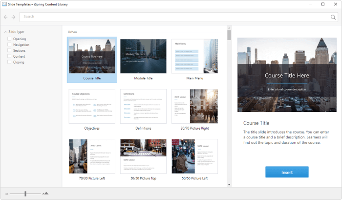
iSpring Suite comes with Content Library, which provides a great collection of presentation templates and allows you to create professional-looking presentations in a matter of minutes. Each template includes basic course elements: a title slide, a table of contents, chapters, a timeline, and info slides. Organize them in the order you prefer, populate them with your texts and images, and your presentation is ready to go.
Conclusion
We hope this article will help you develop an ideal structure for your PowerPoint presentation and do this quickly and easily. Captivate your audience with a powerful and persuasive presentation!
Do you have any other insights on how to simplify PowerPoint slides design? Please share them in the comment section. We’d like to hear from you.


